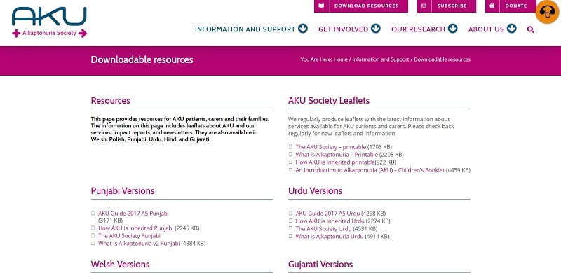
In this week’s blog, we look at the much-anticipated relaunch of the AKU Society website.
Our new site has been designed to be much more user-friendly, accessible and easier to navigate while allowing the most important content to be front and centre.
Earlier last year we were informed that the software we use to host and edit our website would shut down in March 2020. This meant if we wanted a website at all, we would have to move to a new system called WordPress. This gave us a brilliant opportunity to tweak and change our website so that everyone can use the site and so that it is accessible to as many people as possible.
Our site now features a redesigned menu anchored around our key aims: information and support, get involved (fundraising), research and about us. Each page has a dedicated landing page with easy to follow links and engaging pictures.

One of the major criticisms from our old website was that it was difficult to find where you can download all our leaflets and newsletters. This has now been redesigned completely. At the top of each page above the menu, you can see the link to ‘Download Resource’ and each resource is now much easier to find.
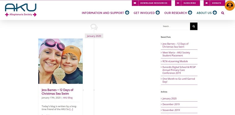
As you may have noticed, our blogs have also changed. It’s now clearer to see when blogs were published and allows us to design them how we want. This will mean how can change how the look based on the content of the blog and increase the font size so that people who struggle to read small text will be able to read them.

We have also continued using the innovative browsealoud plugin. Browsealoud is designed to make websites even more accessible by translating content more faithfully than Google and helps people with learning difficulties and mild visual impairment by reading text aloud and with text masks. To learn more about browsealoud and how to use it head to the blog here.

We are on the lookout for patients and users of our website to join our team of expert reviewers. If you would like to get involved, we will send you a form to fill in which will ask you what you think of the site, if you feel it is useful for you or newly diagnosed patients and what you think we can improve. Your help is crucial for our new website; without the patient input, we won’t be able to judge if we are helping the community.
If you would like to get involved in the review of the website, have noticed any errors or think that we should include and expand upon information, please contact Ciarán Scott by emailing ciaran@akusociety.org
We want to say a huge thank you to the team at DIG Online, who have designed the site with our input. They have made the process easy and stress-free. They have also exercised extreme patience which is always appreciated.
